Nivea | Packaging for the Visually Impaired
Medium: Packaging | Timeline: 4 weeks
Tools: Dimension + InDesign + Illustrator + Photoshop

visually impaired.
According to the International Agency for the Prevention of Blindness (IAPB), In 2017, it was estimated that at least 253 million people world-wide are visually impaired; 36 million of which are blind and 217 million of which have moderate to severe visual impairment. With such a large population being part of this category, design should be more inclusive and universal to support their needs.
Having 20/20 vision is the normal visual acuity (clarity or sharpness of vision) measured at 20 feet of distance. If you have 20/20 vision, you can see clearly at 20 feet what should normally be seen at a distance, verses if you have 20/100 (or 4/20) you must be as close as 20 feet (or 4) to see what a person with normal vision can see at 100 feet (or 20). On a scale, it can range from mild (visual acuity worse than 6/12 to 6/18), moderate (visual acuity worse than 6/18 to 6/60), severe (visual acuity worse than 6/60 to 3/60) and blindness (visual acuity worse than 3/60).
This packaging concept for Nivea’s line of body lotion –verses their current design– incorporates aspects to create a universal design to include those who are visually impaired. Nivea’s most outlined brand guidelines are “Nivea cares” and that they “value the importance and power of touch”. Since both parties prioritize the same values, it was only fitting to embrace the potential for them both.

real-life sights.
Marc Powell –strategic accessibility lead at the Royal Institute of Blind People (RNIB)– blind himself, is a real-life example who outlines the issue in universal design for the visually impaired. “If you can’t make an independent choice, then that’s going to ultimately really impact the individual…whether they have particular dietary requirements or whether you have a particular allergy, or simply accessing safety information.”
Many of your everyday citizens, take Carley Gregory for example who has had complete vision loss from the age of 13, has constant issues telling a lot of products apart. “I went in to ask the people I live with which was which, as both bottles were identical,” she said. “They told me…and by the time I got upstairs, I couldn’t actually remember which one I put in which hand.” She continued, “I didn’t want to go back down and ask again, so I thought I’d hope for the best. Within three or four days, my skin went really, really tight, dry, and stiff…and then I realized I was actually using shower gel instead of body lotion after the shower, and that was quite painful for two weeks.”
Ultimately, it comes down to a lot of guessing – which has its own downsides.
embracing universal design.
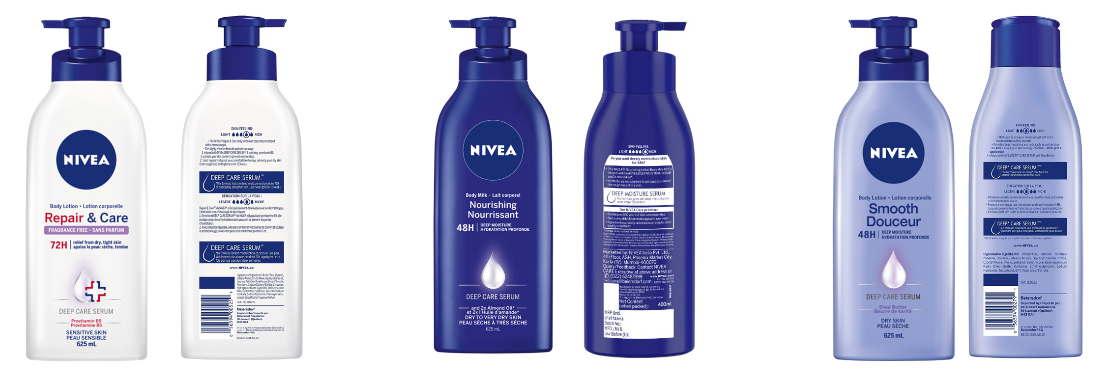
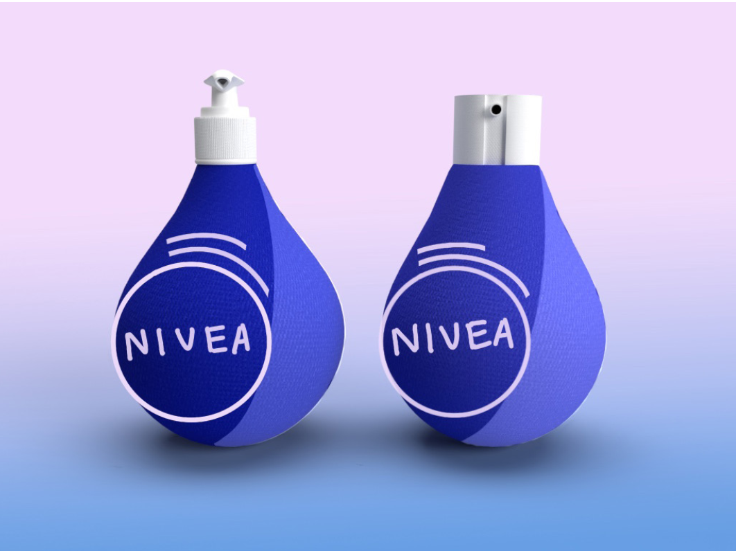
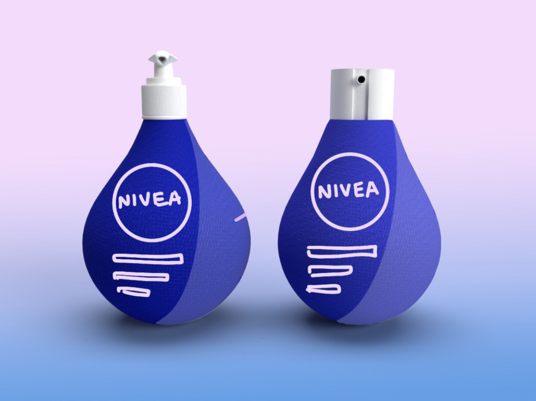
Nivea’s lotion package withholds a strong shelf presence with the iconic blue bottle and strong contrast. However, the slim design is susceptible to being knocked over and there is no touch element to distinguish product from others within the line. The slim design also leads to crowding of text on the back panel, which can be overwhelming to read.
The biggest and most important aspects of the packaging is that it should be inclusive; In this case, for the visually impaired. Extensive touch features would be major factors to help identify the contents housed within the package, whether it be symbols, grooves or textures.
The packaging also requires accessible options enabling an ease of access, but not too accessible that children or infants would easily be able to gain access. The adaptable visuals would assist with those with mild to moderate visual impairment to act as visual signifiers that are much easier to identify. It also would not hurt to have a sustainable aspect thrown in as well.
crucial touchpoints.
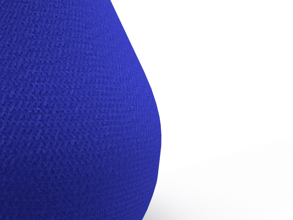
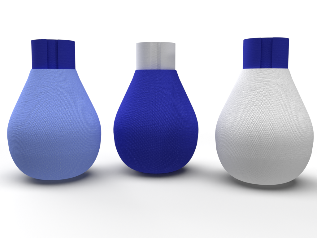
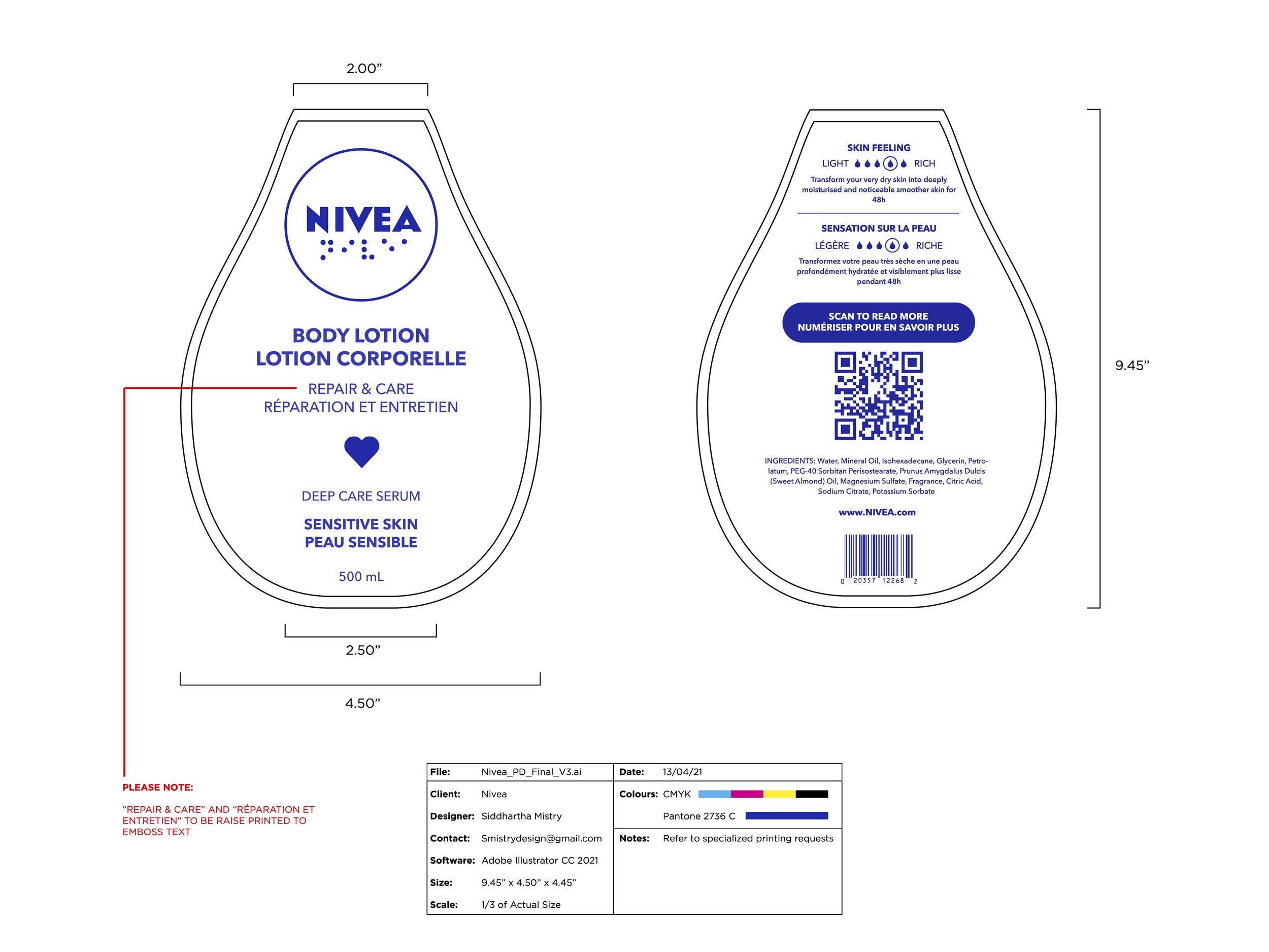
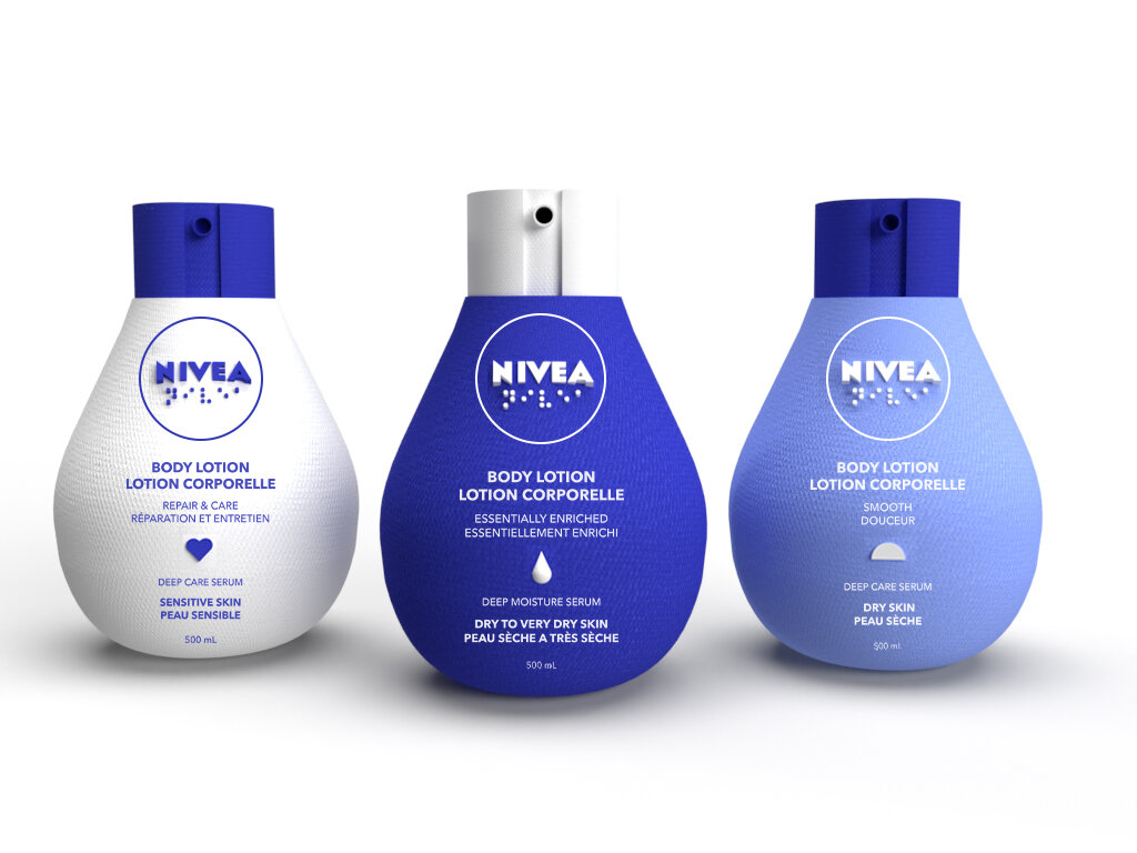
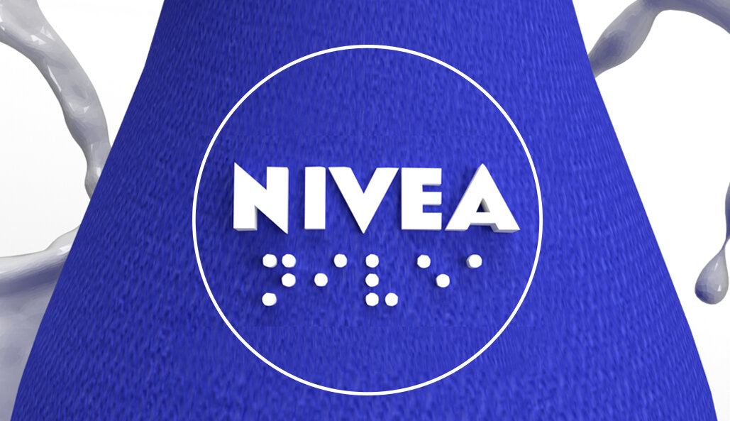
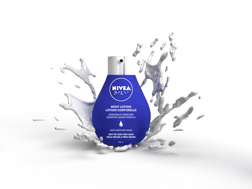
The packaging embraces the value and importance around touch. The unique texturing of the bottle gives it a distinct feel from its competitors and includes an embossed icon system to identify and help distinguish each individual lotion within the line. The embossed product information is displayed on the face panel alongside a raised Nivea brandmark written in both English and braille.

adaptive visuals.
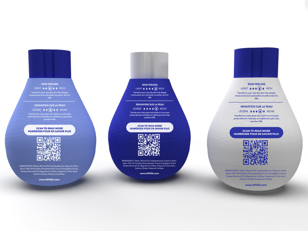
High contrast, size and hierarchy were all taken into account during the design process. The main priority for the visual signifiers were to make them easy to distinguish for those who may be slightly sight impaired and remain informative for those who may have it more severe. Both panels follows an informative hierarchal format providing the key product information to avoid overfilling visuals.
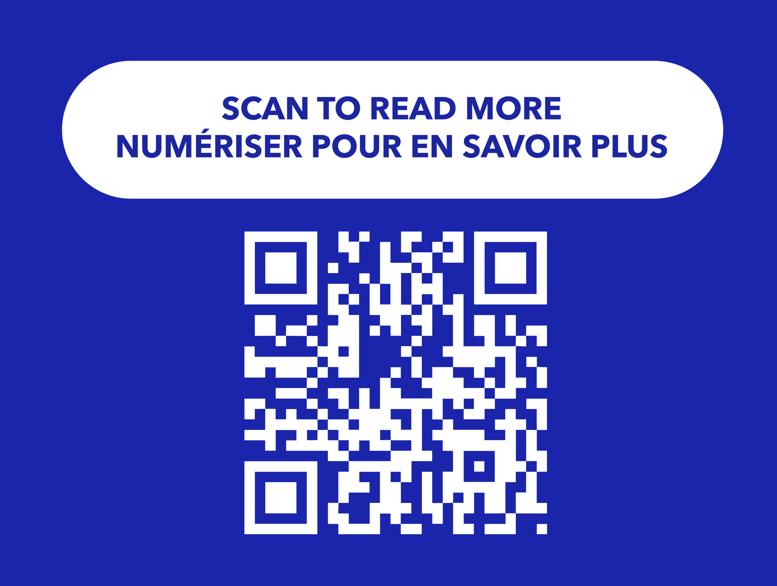
A QR code is provided on the back of the lotion bottle to direct the consumer to further product information delivered through the means of auditory and narrative deliverables; thus, avoiding overwhelmingly crowded information.
sustainably sourced.
The bottle is constructed from a recyclable and backyard compostable “paper” substrate sourced from the paperwaterbottle company composed of two outer pulp shells and a thin inner barrier. The pulp shells are built from compressed bamboo and sugar cane pulp creating a paper-like material. The thin inner lining is comprised of organic materials that are designed to attract microbial activity to weaken and break down plastics in landfills. Not only is the bottle itself decomposable, it also assists in the decomposing of surrounding plastic material in landfills.